Wondering about what are the conversion rate optimization best practices for your website? Or want to increase your current conversion rate? If yes, then you’re in the right place.
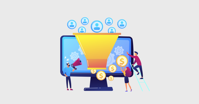
Conversion is turning your user or visitor into a customer or achieving a desired action on a website. Which contributes to business growth and revenue generation. But it’s not that easy to increase your conversion rate.
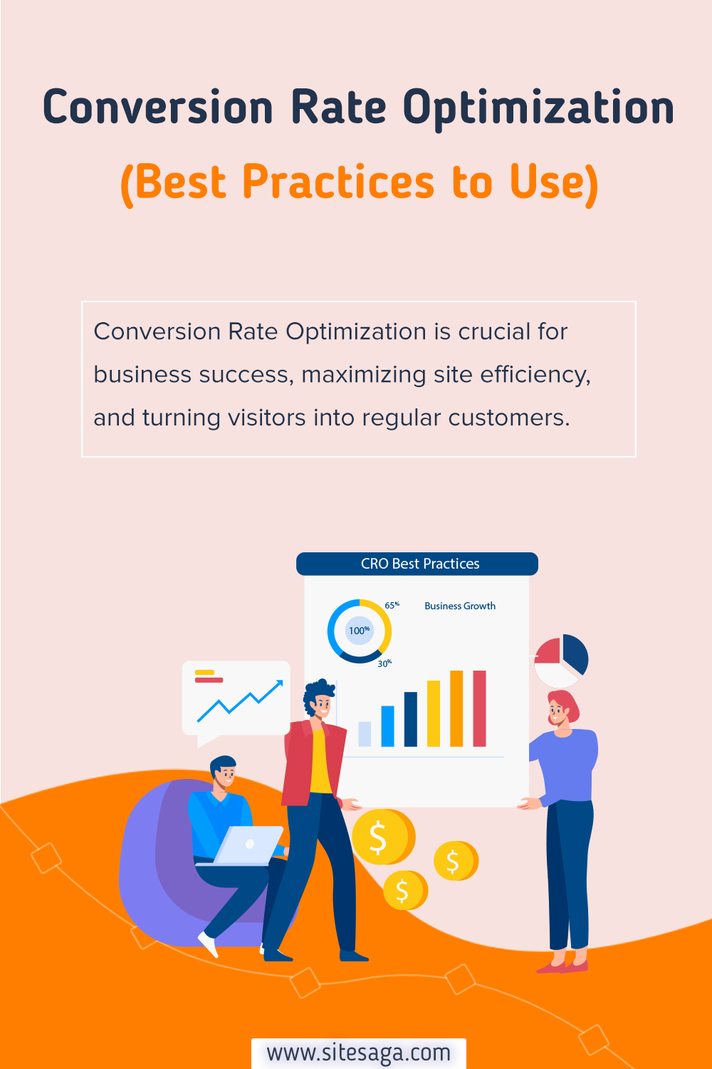
For this, you need to have proper Conversion Rate Optimization (CRO). It’s the systematic process of improving the percentage of website visitors who take the desired action. The actions can be making a purchase or filling out a form.
Besides, there are tons of CRO practices, so it can be confusing to choose which one works better. So here, we’ll walk you through the conversion rate optimization best practices you can use on your website.
Let’s get started!
What is Conversion Rate Optimization?
Conversion Rate Optimization (CRO) is a process focused on improving the percentage of website visitors who take a desired action.
If you ask what the desired action is? It’s a conversion, it could be making a purchase, filling out a form, signing up for a newsletter, or any other specific goal.
Besides, the primary focus of conversion rate optimization is to enhance the user experience and lead generation. It involves analyzing user behavior, identifying areas of improvement, and implementing changes to optimize the conversion funnel.
Here are some key reasons why CRO is important:
- Increased revenue: By improving the conversion rate, a business can generate more revenue without necessarily increasing its marketing budget. Converting a higher percentage of existing traffic into customers or leads.
- Better Return on Investment (ROI): CRO allows you to make the most of your existing traffic and marketing efforts. By optimizing the conversion funnel, you can achieve a better return on marketing investment by turning visitors into customers.
- Enhanced user experience: It improves the overall user experience. Make your website or landing page easy to navigate, visually appealing, and optimized for user interactions. It’ll increase the conversion rates and enhance user satisfaction.
- Data-driven decision-making: CRO involves data collection, analysis, and experimentation. By relying on data, you can make informed decisions about website improvements rather than relying on assumptions.
- Improved marketing efficiency: It helps in refining marketing strategies by identifying the most effective elements and channels. This optimization leads to more efficient and cost-effective marketing campaigns.
- Reduced bounce rates: Optimizing for user experience, page load speed, and relevancy can reduce bounce rates. When visitors find what they are looking for easily, they are more likely to stay on the site and complete the desired action.
Having said that, let’s move forward to learn how to calculate your website’s conversion rate.
How to Calculate Conversion Rate?
So until now, we know what conversion is.
Now if you want to calculate your conversion rate, then first you need to know what you’re trying to calculate. It can be any type of your business goals as we’ve discussed earlier.
So to calculate the conversion rate, divide the number of achieved goals within a specific time frame by the total number of website visitors and then multiply the result by 100.
Conversion Rate = (Number of Conversions or Goals Achieved / Total Visitors) * 100
For example, If your landing page received 10,000 visitors and 3,000 of them completed the desired action, then your conversion rate would be 30%.
So now you must be curious what is the optimal conversion rate. Let’s look into that as well!
What Conversion Rate is Good?
Finding the ideal conversion rate isn’t a straightforward task. It depends on factors like your business, competitors, and whether your target is consumers or businesses.
While there’s no one answer, but a higher conversion rate than your current one is generally desirable.
Although universal examples don’t exist, you can still get insights from industry standards.
- B2B sector: A typical metric is 1-2%.
- B2C ecommerce: The standard is around 1%.
- Medium-value B2Cs: Often aim for about 2%.
- In low-value B2C: The target is approximately 3-4%.
(Source)
If your e-commerce conversion rate falls below these benchmarks, then it indicates intense market competition. Or you need to align the store with industry best practices.
Regardless of the cause, identifying and addressing these issues is crucial. Therefore, analyze the problems and practice a new strategy to enhance your conversion rates.
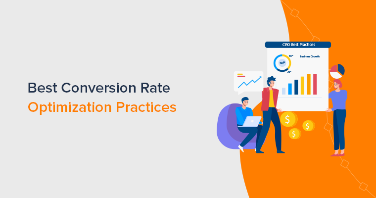
14 Conversion Rate Optimization Best Practices to Use Now
Improving things can be tough, whether it’s keywords or boosting conversions. It might seem a bit much to enhance your current situation and website.
To simplify things, we’re sharing some top practices for Conversion Rate Optimization that can boost your conversion numbers.
1. Analyzing Your Current Conversion Performance
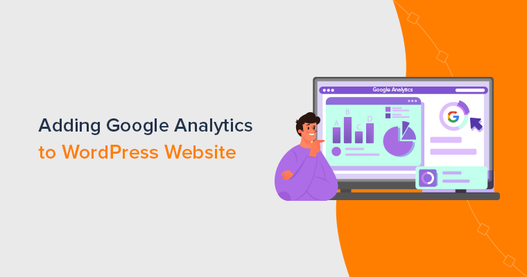
Understanding your website’s current conversion performance is a basic step for starting optimization. Begin by looking into your analytics tools, with Google Analytics being a popular choice.
You can look at the overall conversion rate, which is the percentage of website visitors who complete the desired action like we did earlier. Also, identify the specific pages with the highest and lowest conversion rates.
Furthermore, break down your traffic sources. Are visitors coming from organic search, social media, or paid advertising? Analyzing this helps decide which channels bring in high-converting visitors.
You can connect your website with Google Analytics easily and get these metrics. Besides, it’s easy to connect with Google Analytics using plugins and extensions available in your Content Management System.
For example, you can use Site Kit by Google or MonsterInsights plugin for WordPress.
How to Track Current Conversion Rate?
So here we’ll discuss how to track your current conversion rate.
Conversion reports help you see how your website is doing in reaching its goals.
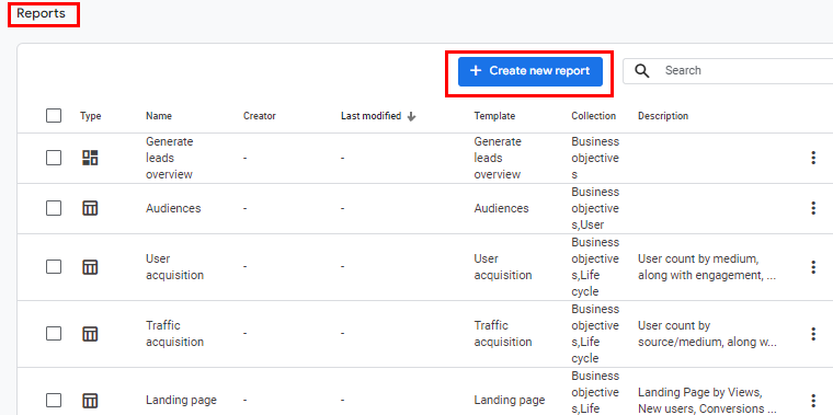
To get started, first sign in to Google Analytics, then from the left menu, select Reports.
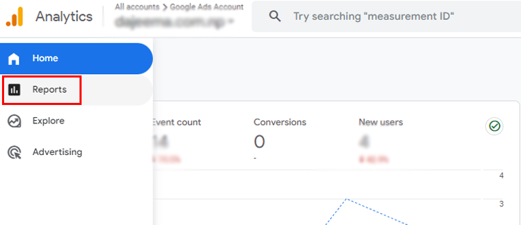
Now, on the left, click Engagement > Conversions.
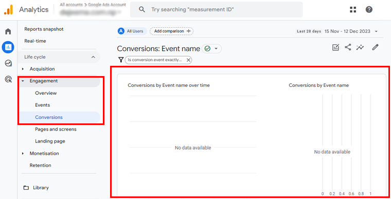
Then you’ll get to see the conversion reports by event name over time. You’ll also get separate reports by event name only.
And there’s your website’s conversion report!
However, if you don’t see the report on the left, then the report may have been removed or the report isn’t included in your default set of reports. If you’re an editor or administrator, then you can add the report to the left navigation.
How to do so? It’s simple, just follow the simple steps below!
In the left navigation, click Library (at the bottom of the left navigation).
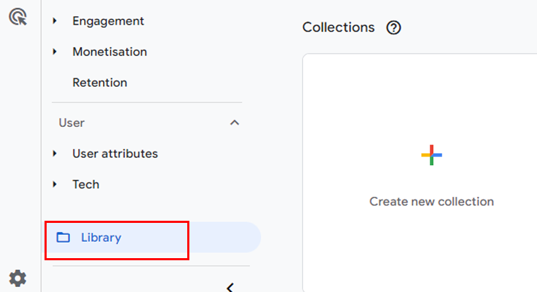
Note: You don’t have Edit permission if you don’t see the Library.
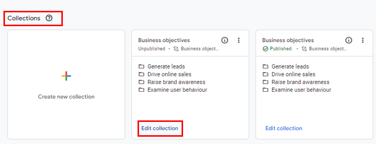
In the ‘Reports’ section, locate the report you want to add to the left navigation or create the report.
Now to the ‘Collections’ section, and locate the report collection where you want to add the report. Make sure the report collection is published so the report appears in the left navigation.
Following that, at the bottom of the report collection, click “Edit Collection”.
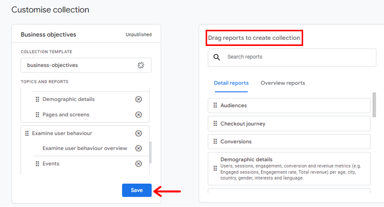
After that, drag the detail or overview report from the card on the right and drop it under a topic on the left. And then, click the “Save” button.
And there you’ve your report!
With these insights, you can tailor your CRO strategy to address specific weaknesses and strengths within your current conversion performance.
To get more insights, check our article on how to use Google Analytics.
2. Optimizing Website Design for Conversions
Today every click matters in digital marketing and optimizing your website design is a must. Also, the art and science of conversion rate optimization come to a main point in website design.
So, to elevate your conversion rate, let’s dive into the following best practices to optimize your website design.
Seamless Navigation
Web design goes beyond looks! If click-through rates drop, then your navigation might have some problems too. So start with a sitemap and prioritize user experience. When you know your goals, content, and audience, navigation design becomes smoother.
With better navigation strategies, you’ll have:
- Better increment on sales.
- Fewer bounce rates.
- Increased visit duration.
- Better user engagement.
Here are some tips for better navigation:
- Limit top-level navigation pages: Keep it clean, 4 to 7 top items, prioritizing the important ones.
- Keep it simple: Main headers shouldn’t link to every page. Use submenus for inner pages.
- Avoid too big headers: Limit your header height, because the content matters too.
- Combine Items: You can hide logins and search inputs. It’s better to reveal on hover while scrolling.
- Fixed headers: This helps users in quick navigation and serves as a prime spot for calls-to-action.
- Dropdowns: For smaller sites, stick to straightforward dropdowns over mega menus.
- Mobile menus: If your website’s not responsive yet, then notify users about the mobile menu for a better experience.
For example, Briogeo features a horizontal navigation menu. When you hover over items, it reveals different navigation options. The “Shop” item displays a mega menu, while the “Learn” option uses a simple dropdown menu.
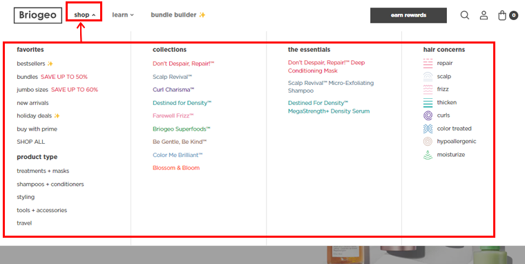
This approach enhances user engagement and showcases the brand’s offerings effectively.
Learn how to make a dropdown menu in WordPress.
Crafting a Seamless Mobile Experience
Most of your visitors come through smartphones, so a responsive and intuitive mobile design is not a luxury but a necessity. Besides, the seamless transition from desktop to mobile ensures that users encounter a consistent and user-friendly interface.
Here are some tips to ensure your website is mobile-friendly.
- Avoid pop-ups, because they work well on desktop versions of websites, but not on mobile devices.
- Mobile users navigate with their thumbs, it’s essential to ensure buttons are adequately sized for easy thumb interaction.
- While a desktop-friendly font size is suggested to be at least 14 pixels, it may not be the same for smaller screens. So test whether the font size looks good on mobile or not.
- It’s better to minimize the number of links, preventing overwhelming blue colors.
- Additionally, restricting redirections to external sites helps to make a smoother mobile browsing experience.
- Avoid cluttering your website with numerous calls to action on a single page.
- Don’t forget to test your website for mobile responsiveness.
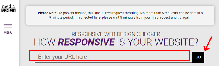
Besides there are many tools you can use to test your website’s mobile responsiveness. For this guide, we’ll demonstrate using a responsive design checker by Media Genesis.
If you go to this site, you can simply add your website URL and click “Go.”
After that, your website will load, and on the left menu bar choose the mobile icon. Now, you get to choose your preferred device screen sizes.
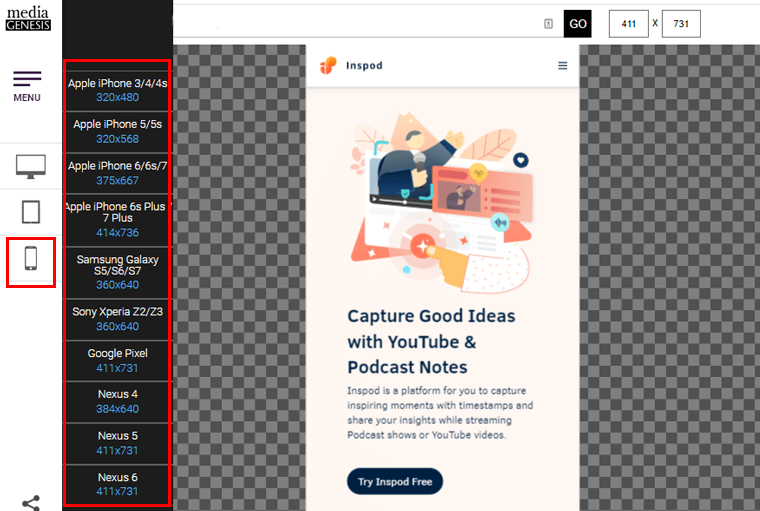
And if your website fits in perfectly, then congrats your website is mobile responsive.
Accelerating Loading Speeds
Today every second counts, and website visitors are impatient. Therefore, a slow-loading website can swiftly turn them away.
So, it’s crucial to optimize your website’s loading speed by compressing images, clearing browser caching, and minimizing unnecessary scripts. A fast website not only engages users but also positively influences search engine rankings.
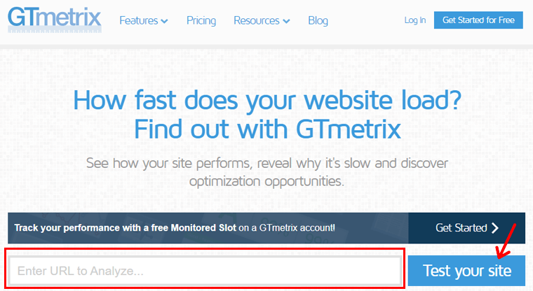
Besides there are several tools that’ll help you check your website’s speed. Here, we’ll be using GTmetrix for this guide.
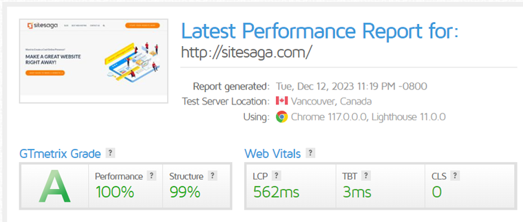
You can start by going to your GTmetrix website. On the home page add your website URL and click on the “Test Your Site” option.
This tool will run the test and quickly you’ll get to see the results. And there you’ll get your website speed result along with GTmetrix grade and web vital scores.
Ensuring Accessibility for All Users
Website accessibility is not just a legal requirement; it’s a fundamental aspect of user-centric design. Implementing accessibility features ensures that individuals with disabilities can seamlessly navigate and interact with your website.
Here are some tips to ensure accessibility optimization:
- First, use <H1> for the primary title only. Do not use it for anything other than at the title of the post. Plus never skip heading levels, i.e., going from <H1> to <H3> and so forth.
- Add an ALT text for your images that describes it better. This makes your content accessible to visually impaired people.
- Improve user experience by replacing vague phrases like “click here” with descriptive alternatives such as “contact us for more information.”
- Choose high-contrast colors, like black letters on a white background, to ensure clear distinctions between various elements on your site.
- Avoid using thin fonts, as they are hard to read.
- Make sure important content on your site is not filled with heavy colors.
- Incorporate keyboard navigation for visually impaired users, enabling them to utilize Braille keyboards for enhanced accessibility on your site.
Besides these tips, you can always test your website to check how accessible your site is. There are tons of tools you can make use of.
For this guide, we’ll use the Accessibility Checker tool, this is an online tool and is free to use.
Start by visiting the Accessibility Checker website and fill in the box with your website URL. After that click on the “Check Website” and it’ll run the test.
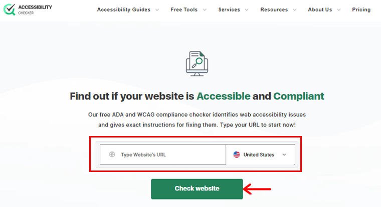
In a short time, you’ll get the result with the status “Compliant” or if not “Not compliant.” Also, you’ll get the accessibility score. As per this site, if your website is below 85 scores then it’s not compliant.
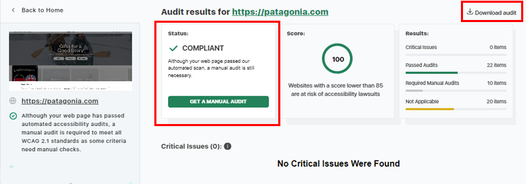
The best part you can also download the audit report of your website’s accessibility test result.
You can also use the accessibility plugins to improve your website’s user experience. For more details, check our article on the best WordPress accessibility plugins.
Strategic Placement of Calls-to-Action (CTA)
The strategic placement of calls-to-action can significantly influence user behavior. So, thoughtfully position CTAs, making them noticeable. Also, make use of compelling language that pushes visitors towards the desired action.
A well-crafted CTA serves as a virtual guide, directing users toward conversions without overwhelming or confusing them.
Here are some tips you can use while adding CTAs to your website.
- Make CTA button visible: It’s crucial to ensure the visibility of CTA buttons on a website to prompt user engagement and drive desired actions effectively.
- Use eye-catching CTA button colors: Vibrant colors attract attention, prompt engagement, and enhance user interaction, potentially increasing conversions.
- Include only one CTA on one page: Helps to maintain focus and guide users toward a clear objective, reducing confusion and increasing conversion rates.
- Make your CTAs short and sweet: They capture visitors’ attention quickly and encourage immediate user engagement on your website.
- Supporting lines before your CTA button: A persuasive message before the CTA button enhances user understanding and encourages engagement.
Not only this, you can always measure the performance by testing, how well are your CTAs performing or if they can do better.
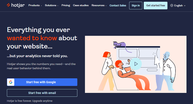
Heatmap is a great feature to track user interaction on your website. It shows where people interact most and least on your page. It also helps find popular sections and spot distractions affecting clicks on CTAs.
There are many heatmap testing tools like Hotjar, Heatmap.com, etc. Although these are premium tools, you’ll also get free trials. So why not give it a try?
3. Optimizing Landing Pages
The gateway to conversion often lies within the design of your landing pages. Whereas, creating an amazing landing page is an art that combines aesthetics and user experience.
Let’s dive into the core best practices to elevate your conversion rates through strategic landing page optimization.
Captivating Headlines
Create headlines that grab your audience’s interest, giving them a short and interesting peek into what’s coming. Use words that catch attention and match what users are looking for, setting the stage for a meaningful interaction.
Besides, a catchy headline can help you in several ways:
- It helps to catch the user’s attention.
- Makes your content stand out.
- Also drives traffic by increasing the Click Through Rate.
- And eventually helps to improve conversion.
Here, we’ll give you some tips on improving and making headlines catchy.
- Add a number: Numbers in headlines grab attention. Readers like short, direct articles. If your headline has a number, readers expect tips or advice.
- Call-to-Action: A CTA, or call-to-action, is crucial for a catchy headline. It guides readers on what to do next, prompting action.
- Use of power words: Create headlines with proven strategies like using power words like “Tested” and “Proven” for attention-grabbing credibility.
- Write many, select one: Creating a perfect headline takes effort. Write at least 10 headlines for a piece, choose the best, and keep them concise.
- Listen to your users: A survey helps know what people think. Run a poll to get audience feedback on headlines. The more votes, the better.
- Analyze headlines: Tools like CoSchedule Headline Studio help to craft effective headlines, optimize for engagement, and improve content performance.
- Your competitors: To make a catchy headline, see what others are doing in search results. Improvise your competitors’ ideas instead of starting fresh.
Persuasive and Relevant Content
Content is vital for your landing page, and its quality can make or break user engagement. So clearly express your product or service’s value, showcasing how it meets their needs.
So how to create better content? Let’s see!
- Skip obvious advice.
- Use details, it’ll help your readers picture your story.
- Add vivid details and emotional stories to engage.
- Utilize specific, sensory adjectives, and metaphors to help to understand.
Once you’ve done these, it’s time to learn how to engage your readers.
- Connect with your audience by understanding their fears, dreams, and desires.
- Write as if you’re talking to a friend, using a conversational and engaging tone.
- Address your readers directly using “you” to create a stronger connection.
- Stand out by sharing your perspective and personal story.
- Use language your readers are familiar with, avoiding jargon and opting for simplicity.
- Be clear without underestimating your audience, and focus on being helpful and generous.
Being a good writer isn’t crucial, but mastering editing is. Here are tips to turn potentially mediocre content into greatness:
- Plan Ahead: Allow time for your first draft to rest before editing.
- Read Backwards: Spot typos by reading your text backward.
- Use a Spell Checker: It’s basic but effective; catch those typos.
- Proofread on Paper: Reduce skimming by proofreading on paper.
- Read Aloud: Identify stumbling points by reading your text aloud.
- Simplify: Cut irrelevant ideas and remember your purpose.
- Avoid Common Mistakes: Check for common errors like “there’s and theirs, complements and compliments.”
- Avoid Clichés: Eliminate meaningless clichés that add no value to your content.
- Shorten First Sentence: Engage readers with a concise first sentence.
- Cut Excessive Words: Delete unnecessary words for clarity and conciseness.
- Replace Complicated Words: Opt for simpler words for easier readability.
- Check Engagement Level: Ensure your content focuses on the reader, minimizing the use of “I” and “me.”
Finally, revisit your headline. Check if you did deliver on your promise. Also, check will your readers benefit from your content or not.
Also, go through our article on the best AI rewriter tools for better content transformation.
Strategic Placement of Visual Elements
Visual elements on a landing page act as narrators, delivering messages at a glance. So strategically placing images, videos, and infographics helps to complement the content.

You can use visuals that resonate with your brand identity. The right images enhance the overall user experience and strengthen your message.
How to use it correctly? Let’s take a look!
I) Choose the Right Visuals
Selecting the appropriate visual for your content plays a vital role in crafting a compelling landing page. Because, different visuals convey distinct messages and emotions, influencing how users perceive your brand.
- Photographs are ideal for showcasing real people and places, increasing trust with your audience.
- Illustrations are perfect for conveying abstract concepts or creating a playful tone.
- Infographics excel in presenting complex information visually.
- Videos effectively demonstrate products or services in action.
Besides, these, consider the overall tone and messaging of your landing page when choosing visuals. Ensure the selected visual not only looks appealing but also complements your message.
II) Use High-Quality Images
Using high-quality images on your landing page is important for a couple of reasons.
- Firstly, high-quality visuals lend a professional and captivating look, increasing user engagement and trust.
- Secondly, these images, aligned with your brand, strengthen your identity and message.
Are you curious about what to do when choosing images? Here are some tips!
- Prioritize high resolution to avoid blurriness. Low-quality visuals can mar professionalism and dilute your message.
- Choose images that mirror your brand and message. For instance, eco-friendly products align with nature-themed visuals.
Besides, you can always hire a professional photographer to get high-quality images. Or you can purchase stock images, or use an AI image generator like the Midjourney tool.
III) Optimize Image
While quality images enhance your landing page, optimizing their size is vital for faster loading. Because large images slow down your page, frustrating users. They might even abandon your page if it takes more than three seconds to load.
So to optimize,
- Use image optimization tools to reduce file size without compromising quality.
- Consider the image format wisely, JPEG suits photographs, while PNG is ideal for graphics with transparent backgrounds.
If you’re curious about how to optimize, then here is a simple demo:
For this blog, we optimized our images before adding them from the online image optimizer. What we did first was create an image as per the size of our blog guidelines.
Then we compressed the images using an online image optimizer TinyPNG. This tool optimizes your WebP, JPEG, and PNG images by 50-80%. The best part, you’ll not lose the quality of your content.
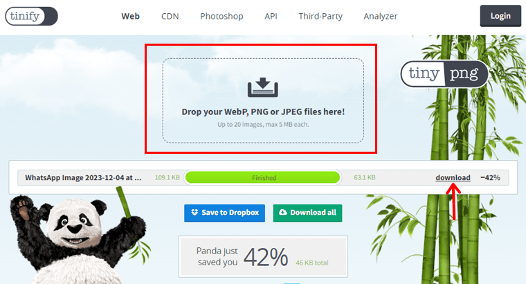
You can use this tool by visiting its site “https://tinypng.com/,” drop your images, and simply compress them. Now download your images and there you have a perfectly optimized image.
IV) Use Images to Highlight Information
Utilizing images on your landing page can be a good strategy to direct attention and guide users effectively. Plus, placing images strategically creates a visual hierarchy, emphasizing crucial content.

Also, adding a compelling image on a landing page can serve as a focus point, capturing the user’s attention. Images can also establish a sense of flow, guiding users seamlessly through different sections of the page.
To take an example, let’s look at the landing page of the Anytime Fitness website. Their landing page includes compelling headlines along with the people working out in the gym on the right side.
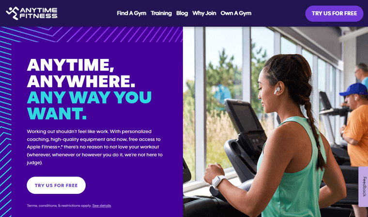
More than directing the user’s view, images excel at highlighting vital information. Whether it’s emphasizing a CTA button or illustrating a key product or service benefit.
V) Creating Color Schemes
The colors on your landing page play a big role in how users perceive your brand and experience your site. To make a visually appealing page, pick colors that match your visuals and overall brand.
Consider the message you want to send:
- Vibrant colors for energy.
- Softer tones for calmness.
Harmonize the colors in your visuals with your overall branding to create a unified look. Use tools like a color wheel to experiment and find the best combinations that resonate with your audience.
This way, your landing page not only looks good but effectively communicates your message and boosts brand recognition.
Optimized Forms for Seamless Interaction
Forms are the interactive phase on a landing page, requiring careful optimization for user convenience. The goal is to keep the balance between collecting necessary information and ensuring seamless interaction.
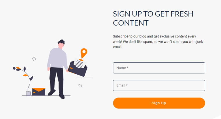
For instance, if you look at the sign-up form on our site, SiteSaga then it’s pretty clean. Our site only collects the information that’s needed. Just like in the image below.
Moreover, online forms play a crucial role in user interaction, serving as gateways to valuable data and vital processes. Whether signing up for a newsletter or completing a purchase, well-designed forms are essential.
And when forms are confusing or time-consuming, they become significant barriers to conversion.
So, understanding form optimization matters!
Now that we know the significance of optimizing forms, let’s see practical advice to enhance your forms:
- Keep It Simple: Reduce form fields to the essentials. Only request vital information. For instance, for a free ebook, an email address might suffice.
- Clear Labeling: Employ clear labels for each form field. Users should instantly grasp what’s required. Steer clear of jargon or ambiguity.
- Gradual User Profiling: When gathering extensive user details, collect data gradually over multiple interactions instead of all at once.
- Error Handling: Implement user-friendly error messages that guide users to correct mistakes. Avoid generic messages like “Invalid input.”
- Mobile Optimization: Ensure mobile-friendliness for forms. Mobile users should experience a seamless process without excessive zooming or scrolling.
After knowing this much, you must be curious about where to place forms on your landing page. Well, here is the answer!
There are 4 things you can do:
1. At the top: Placing it at the top ensures immediate visibility, capturing visitors’ attention and encouraging engagement.
2. With compelling content: Next to compelling text or visuals creates a seamless flow, guiding visitors toward form completion.
3. End of persuasive sentences: At this point visitors are likely convinced of your value proposition, increasing their intention to take action.
4. Pop-up or slide-in forms: Well-timed pop-up or slide-in forms trigger to take action after a specific time on the page or before visitors leave.
If you’re building a landing page, check out our article on the best landing page themes.
4. Optimizing Product Page
Your product page is like a stage where visitors decide to buy. It’s not just a display, it needs careful improvement for better results.
Let’s explore how to make your product page more appealing to turn visitors into customers.
I) Show off Your Product with Great Pictures
Use clear, attractive pictures of your product from different angles. Let visitors zoom in to see details. Each image should tell a story and make potential customers want to buy.
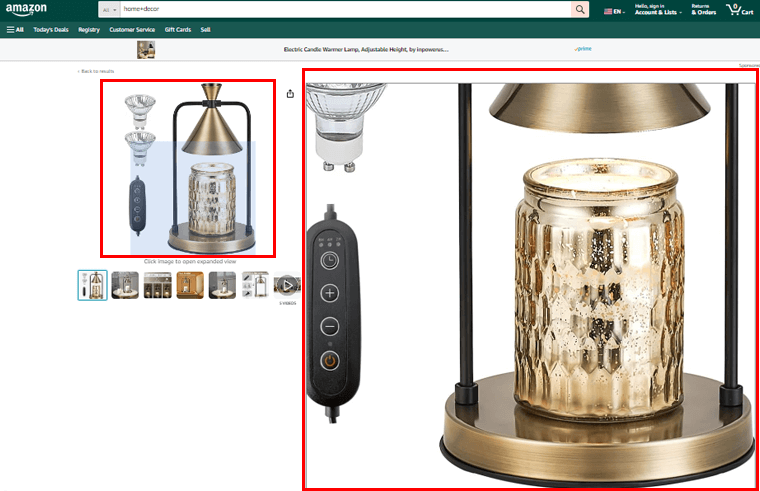
For example, if you look at the products on Amazon, if you hover over any images it’ll auto zoom. So you can see every angle on the images.
II) Write Descriptions that Sell
Make your product descriptions more than just facts. Tell a story about how your product fits into someone’s life. Use words that persuade and create an experience, not just a description.
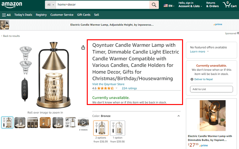
To take an example, every online marketplace like Amazon, eBay, etc has a description of every product. So if you click any products you get to see their features and know what you are buying.
III) Make Navigation Easy
Make it easy for visitors to move around your product page. Add filters and sorting options so users can find what they want. The journey from looking at the product to buying it should be smooth.
For instance, if you go to the site Etsy, you can see simple menus on the header. And if you hover over the “Category” menu it displays the dropdown menu, displaying the categories you need.
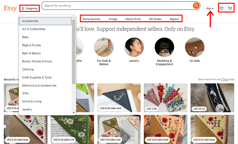
Besides, there is also a search box which is easily available at the top of the header. Moreover, you’ll find the cart icon, where you’ll find all our selected products. Alongside the cart, you’ll see a favorite icon, which will display all the products you’ve marked favorites.
Also, the Sign In option is visible for its users to create an account.
IV) Share What Others Think
Show what other customers think about your product. Include reviews, ratings, and testimonials on the product page. Let potential customers see that others have had a good experience with your product.
Amazon stands out as a prime example of an e-commerce giant elevating the importance of reviews. People often turn to Amazon, even if they make offline purchases, to determine the worthiness of a product.
V) Put Buttons in the Right Places
Place buttons that guide visitors to the next step strategically. Whether it’s adding to the cart, looking at other products, or making the purchase. Make sure the buttons lead users to the next action smoothly.
VI) Make it Work Well on Phones
Many people use their phones to shop. Make sure your product page looks good and works well on mobile devices. Also, images should load quickly, descriptions should be short, and buttons should be easy to tap.
5. Make Changes Based On Your Users’ Interaction
Start tracking your customers’ actions now. Why? Because it reveals how your site is doing, what they like, which products sell most, and where they come from. And understanding customer behavior is crucial.
For this purpose, Google Analytics is a widely used tool for tracking how people behave on a website.
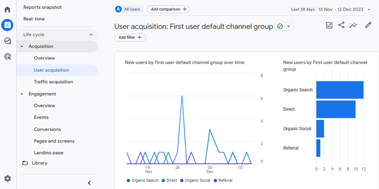
Even the free version helps you see your organic searches, direct searches, direct social, and referrals.
If you ask why we need this data? The answer is, to create a website for a better user experience that not only captures attention but turns it into meaningful conversions.
6. Proper Competitor Analysis
Understanding your competitors is crucial for improving how well your website turns visitors into customers. In simple terms, proper competitor analysis helps you learn from others, make your website better, and ultimately get more people to buy from you.
When you study what your competitors are doing, you’ll get:
- What’s working: You can see what strategies are successful for them in getting people to buy.
- What’s not working: You can identify mistakes they might be making that you can avoid.
- New ideas: You might discover innovative ideas that you can use to make your website better.
- Customer experience: By checking how your competitors treat their customers, you can improve your customer service.
Before diving into research, it’s crucial to know who your competitors are. The simplest way is to look at businesses where your target customers can find similar services or products.
Identify Competitors
– Direct competitors: These are businesses selling the same things you do. For instance, if you sell books, another bookstore is a direct competitor.
– Indirect competitors: Using the bookstore example, a stationary is an indirect competitor. They fulfill book needs but with a different specialty.
Therefore, understanding both types is vital.
Now, to find your top competitors for research, consider these methods:
- Search online: Look for businesses similar to yours on search engines.
- Take customer feedback: See who customers mention as alternatives or options.
- Look into industry reports: Check reports in your industry for key players.
- Social media: Explore social platforms to identify active competitors.
- Networking: Connect with others in your industry to discover competitors.
Identifying competitors helps you conduct effective research and stay informed about your business landscape.
Experience Your Competitors’ Products
Another crucial part of checking out your competitors is trying out their products or services yourself.
For online stores, place an order and go through the entire buying process. Pay attention to what they do well and where they might be making mistakes.
Maybe they’ve added a chatbot to assist shoppers efficiently. To enhance your conversion rate optimization, think about incorporating a chatbot on your site.
Evaluate the User Experience (UX) on your competitors’ websites. Ask yourself:
- Is it easy to move around their site?
- Are there distractions on their pages?
- How easy is the text to read?
- Was the purchase process simple?
Also, check how well they handle customer complaints after a purchase. It’ll allow you to spot areas for improvement. As well as understand the strengths and weaknesses of your competitor’s site.
You can also gather opinions from friends, family, or your customers who have been to that online store.
7. Free Trials or a Generous Return Policy
Having a clear return and free trial policy is like offering a secure shopping experience for your visitors. This strategy gives them confidence in their purchases and increases your conversion.
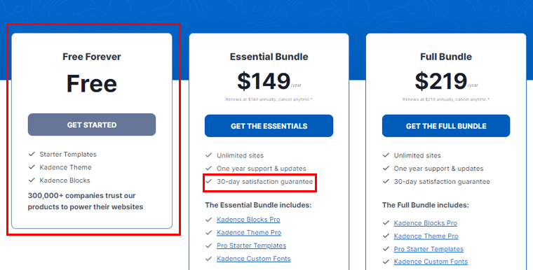
For example, if you look at the image below, it’s the pricing plan of the Kadence theme. This theme not only offers the free version but also provides a 30-day return guarantee. So users are likely to try this theme.
Besides, a customer-focused return policy is powerful, it not only boosts sales but also reduces cart abandonment. When buyers know they can shop without doubts, they are more likely to complete their purchases.
How to create a better refund and return policy? Here are some tips:
- Your return policy should be in clear language, customers might hesitate if it’s confusing.
- Keep it easily accessible on every product page to inform and influence buying decisions.
- Processing returns has costs but also benefits because free returns boost customer confidence and increase potential sales.
- Include a pre-printed packing slip with every order for easy returns and provide all information for processing.
- When customers love a product but it’s the wrong size or color, easy exchanges create satisfaction and repeat business.
- When customers return items, offer a simple way for them to share why.
- Use feedback to improve and prevent common issues, like sizing confusion on product pages.
Hence, your customers hesitate when dealing with stores that don’t facilitate easy returns for faulty items or changes of mind. So, a transparent return, refund, and exchange policy helps in making a sale or turning a visitor into a loyal customer.
8. Create Urgency (FOMO) with Quick Discounts
Fear of Missing Out (FOMO) is when people feel anxious about not being part of something exciting or beneficial. Businesses use FOMO to encourage quick actions, like purchasing a limited-time offer.
Besides, this fear is stronger with social media, where people see others enjoying things. So, by creating a sense of urgency or exclusivity, you can make customers act fast.
To boost conversion rates, the strategy of inducing urgency through speedy discounts is a must.
Let’s explore how creating the FOMO can impact conversions:
| Factors | Description | Example and Stats |
|---|---|---|
| Introduce Limited-Time Scarcity | Grab attention by offering discounts for a limited time, creating a sense of scarcity. | Products labeled as “limited time” see a 30% increase in conversion rates. |
| Create Irresistible Offers | Compelling discounts are not just about numbers, they trigger a fear of missing out. | For example, Amazon’s Lightning Deals are time-limited, creating urgency and driving purchases. |
| Use Strategic Messaging | Convey the urgency in your messages to elevate the desire for quick discounts. | Campaigns with clear urgency messaging can have a 22% increase in conversion rates. |
| Add Exclusivity to Discounts | Making quick discounts or limited editions to products feel exclusive, adding urgency for unique goods. | The strategy used by airlines, limiting seat sales to a short period, prompting quick bookings. |
| Conclude with Persuasive CTAs | Wrap up the urgency strategy with compelling Calls-to-Action (CTAs) for immediate conversions. | Amazon’s “Limited Time Offer” tag on products is a prime example, urging users to buy before the offer ends. |
9. Strategies to Recover Abandoned Carts
Experiencing a high rate of shopping cart abandonment on your online store? You’re not alone. As per Forrester Study, almost 88% of online customers agree to abandon their carts.
So, what’s the solution? Enter retargeting!
Retargeting ensures that your ads reach customers who recently visited your store. Then added items to their carts, but left without purchasing.
You can make the deal by including special offers or discounts in these retargeting ads. Attracting your costumes to return and finalize their transactions.
Moreover, consider reaching out to cart abandoners via email if you’ve their contact information. Send them a gentle reminder to complete their purchase, and consider adding an attractive incentive. So your customers will have reasons to return to your store.
Besides, there are tools like the Criterio and Target2Sell, that offer automation for retargeting efforts, reducing instances of abandoned carts.
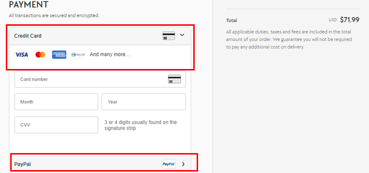
10. Multiple Payment Options for Customer Convenience
Offering multiple payment options is a strategic move that enhances customer convenience and boosts your business’s success. By providing a variety of payment methods, you cater to diverse customers, making it easier for them to complete transactions.
Here are some options:
- Credit and Debit Cards: Accepting major credit and debit cards is fundamental for conversion. These widely used payment methods provide convenience for customers while offering a familiar and trusted transaction process.
- Digital Wallets: Embrace digital wallets like PayPal, Apple Pay, Google Pay, or other region-specific options. These platforms offer a swift and secure checkout experience, particularly appreciated by tech-savvy consumers.
- Mobile Payments: Integrating options like Venmo, Cash App, or other mobile-specific payment applications targets growing mobile users. This appeals to users who prefer managing transactions directly from their smartphones.
- Offline Payments: Provide customers with the option for offline payments or cash on delivery. This is advantageous for customers who prefer traditional, non-electronic methods.
- International Payment Options: If your business serves a global audience, ensure compatibility with international payment options. Integrating Alipay, WeChat Pay, or other region-specific methods to accommodate diverse customer bases.
- In-App Purchases: If your business has a mobile app, streamline the checkout process by enabling in-app purchases. This enhances the user experience for customers who prefer to shop through dedicated mobile applications.
- Subscription Billing: Implement subscription billing for products or services with recurring payments. This option is beneficial for businesses offering subscription-based models, ensuring a seamless and automated payment process.
For example, if you buy any products from Kylie Cosmetics, you’ll have many payment options using the card. Or choose a payment gateway like PayPal.
11. Allow Guest Checkout and Reduce the Checkout Process
Recognizing the importance of a seamless online shopping experience, allowing guest checkout, and optimizing the checkout process are integral strategies for enhancing customer satisfaction and encouraging conversions.
Benefits of Guest Checkout
- Faster Transactions: Guest checkout eliminates the need for customers to create an account, streamlining the transaction process and allowing them to complete their purchases more quickly.
- Improved User Experience: Simplifying the checkout process enhances the overall user experience, making it more convenient and less time-consuming for customers.
- Enhanced Conversion Rates: Guest checkout caters to impulsive buyers or those with a one-time purchasing intent, leading to improved conversion rates as customers are more likely to complete their transactions.
- Increased Trust: Providing the option for guest checkout reflects transparency and respects the customer’s desire for simplicity. This, in turn, contributes to building trust in the online purchasing process.
Strategies to Reduce the Checkout Process
| Strategies | How to do? | Results |
|---|---|---|
| Optimized Form Fields | Minimize the number of mandatory form fields to only collect essential information. | This will reduce the hassle of filling out lengthy forms for your customers. |
| Progress Indicators | Communicate the steps involved in the checkout process by incorporating progress indicators. | This helps customers understand how much more information is required, managing their expectations and reducing anxiety. |
| Auto-Fill and Autofocus | Implement the auto-fill feature for known information and set autofocus on the first form field. | This will improve the efficiency of data entry for customers. |
| Mobile Optimization | Ensure that the checkout process is optimized for mobile devices. | Most online shoppers come from mobile devices, which increases your sales. |
| Guest Checkout Option | Present the option to check out as a guest prominently. | This will let users complete their transactions without having to sign up. |
| Express Checkout Options | Integrate express checkout options, like one-click or saved payment methods for returning customers. | Creates better user experience and increases product sales. |
| Secure Payment Icons | Display recognized and trusted secure payment icons. | Assures customers of the safety of their transactions and reduces concerns related to payment security. |
| Real-Time Validation | Implement real-time validation for form entries, helping customers correct errors promptly. | This ensures accuracy in the information provided. |
| Guest Account Upgrade | If a customer initially checks out as a guest, offer the option to create an account after the transaction is complete. | This provides a seamless transition for those interested in future engagements. |
By using these strategies, you can create a more user-friendly and efficient checkout process.
12. Run A/B Testing
A/B testing, also known as split testing compares two versions of a webpage, email, or other elements. The test determines which performs better in achieving a specific goal.
There are several types of A/B testing. Each focuses on different aspects of the user experience or marketing strategy. Here are some common types:
- Basic A/B Testing: This test evaluates different variations of specific webpage elements, like headlines, images, and buttons. Allowing businesses to fine-tune individual elements for optimal user engagement and increased conversion rates.
- Multivariate Testing: Test multiple variations of various elements, providing an overall understanding of how different combinations impact user experience. This in-depth analysis is crucial for gaining comprehensive insights into user behavior.
- Split URL Testing: Compare different URL structures or designs to determine the conversion-friendly layout or structure. This offers insights into broader structural improvements that positively impact the user journey and overall conversion rates.
- A/B/C Testing: Test three different versions of a webpage or element to assess which design brings the highest conversion rates. This approach allows you to explore varied design strategies and identify the most effective approach for driving conversions.
- Email A/B Testing: Allows you to refine email strategies for maximum engagement and conversions. Good subject lines, email copy, and calls-to-action contribute to higher open rates, click-through rates, and ultimately, improved conversion rates.
However, if you’re worried about how to complete this testing, then you can always use an A/B testing tool. Some of them are AB Tasty, Optimizely, Visual Website Optimizer, etc.
13. Regular Email Campaigns
When it comes to sending regular emails that people act on, some simple tricks can make a big difference. First off, your subject lines should be catchy and make sense. You want to grab people’s attention right away.
Below are some things you should consider while creating email campaigns.
- Craft attention-grabbing subject lines that relate to reader interests.
- Deliver a clear message with a singular call to action for simplicity.
- Ensure mobile optimization for readability on smaller screens.
- Personalize content by addressing recipients by name and tailoring to their interests.
- Segment your audience based on demographics or behavior for targeted communication.
- Use engaging visuals that complement the message without overwhelming it.
- Experiment with A/B testing for different elements like text and images.
- Create urgency through limited-time offers or exclusive deals.
- Include social proof, such as positive reviews or testimonials, to build trust.
- Keep emails concise, communicating main messages and benefits.
- Optimize landing pages for a seamless transition from email to action.
- Monitor analytics regularly, analyzing open rates and click-through rates for insights.
Besides, you can easily create email campaigns using Mailchimp, MailerLite, Campaign Monitor, etc.
Also, you can check our article on the best email marketing service for business growth. If you want to connect your WordPress site with Mailchimp, then, consider looking at our article on the list of best Mailchimp plugins for WordPress.
14. Building Credibility Through Trust Signals
Adding trust signals on your website can make a significant difference. Trust signals are elements that reassure visitors about the reliability and security of your business.
In this section, we’ll explore the importance of trust signals that can boost your online credibility.
Customer Testimonials
Customer testimonials are friendly signals from those who have experienced your products or services. By showcasing positive feedback from satisfied customers, you’re offering real-life evidence of your business’s value and reliability.
Moreover, testimonials provide a human touch, helping visitors relate to others who have benefited from your offerings. Consider placing these testimonials strategically on your website, emphasizing the positive experiences and outcomes shared by your customers.
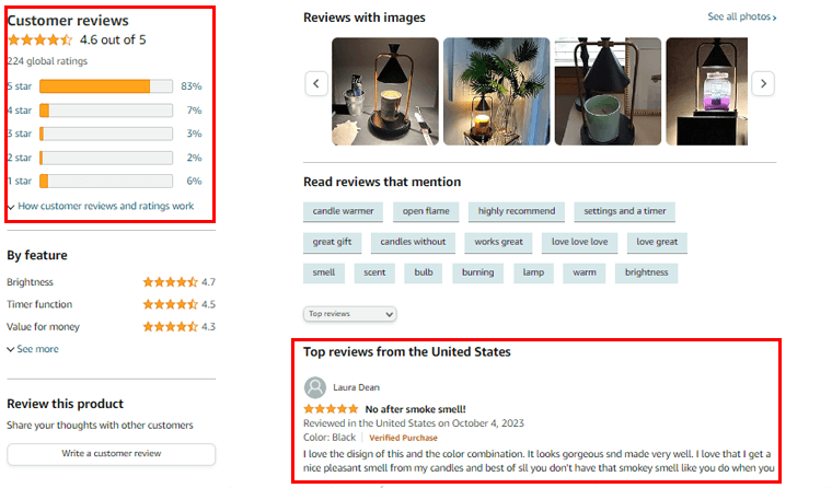
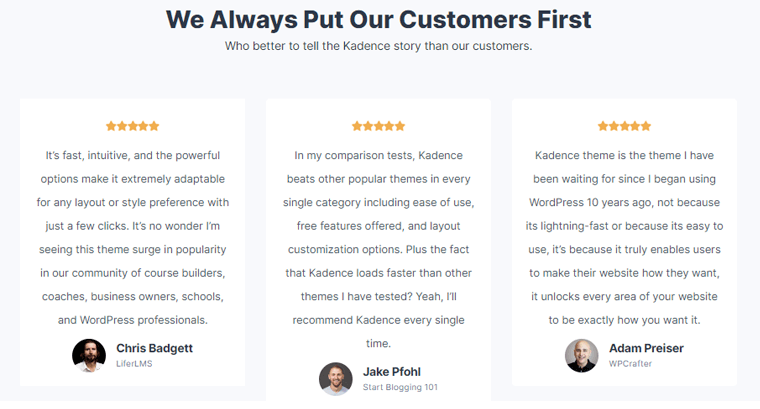
For example, in the below image, you can see the user reviews for Kadence by WordPress experts.
Trust Badges
Trust badges are small icons or symbols displayed on your website to convey security and reliability. Common examples include SSL certificates, payment method logos, and industry certifications.
These badges visually assure visitors that your website is secure, their data is protected, and transactions are safe. Placing trust badges, especially near key action buttons helps build trust by indicating that your site follows security best practices.
For instance, here, you can see Astra trust badges from Trustpilot and WordPress.org.
Certifications
Certifications from recognized authorities or industry organizations serve as endorsements of your business’s credibility. So, display relevant certifications to communicate to visitors that your business follows industry standards and best practices.
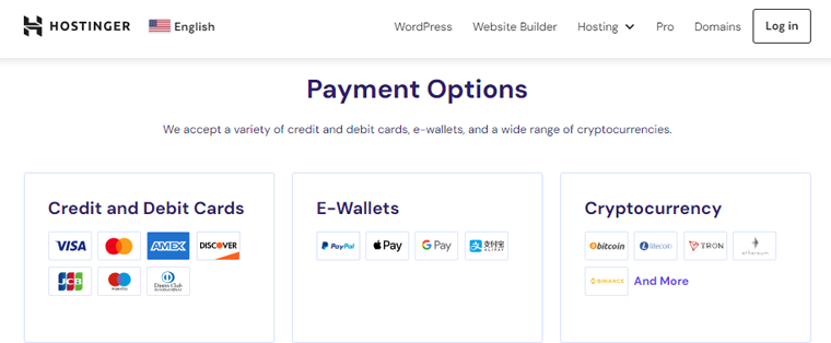
Secure and Transparent Payment Options
The way you handle payment transactions significantly influences trust. Ensure your website uses secure payment gateways and prominently displays secure payment logos.
Clearly outline your pricing and payment processes, avoiding hidden fees or unclear terms. Because, transparent payment options, coupled with secure transactions, contribute to a positive customer experience and trust in your business.
For example, Hostinger, one of the best web hosting, accepts payment from Visa, Mastercard, and more.
15. Other Additional Practices
Some other conversion rate optimization best practices include:
- Implement exit-intent pop-ups to capture departing visitors.
- Utilize social proof to build credibility and trust.
- Provide visible contact information for customer trust.
- Simplify the language for easy understanding and accessibility.
- Implement live chat support for real-time customer assistance.
- Optimize website content for search engine visibility.
- Regularly update and refresh website content for relevance.
- Implement a user-friendly and intuitive website search function.
- Implement gamification elements to enhance user engagement.
- Create a seamless transition from ads to landing pages.
- Optimize for local search to attract relevant regional audiences.
- Optimize your website for various browsers and devices.
- Implement user-friendly and intuitive product filtering options.
Best Conversion Rate Optimization Tools You Can Use
Below are some of the best conversion rate optimization tools that you can utilize.
1. Google Analytics
Google Analytics is a powerful web analytics tool that provides in-depth insights into website traffic and user behavior. It offers features such as goal tracking, conversion tracking, and funnel analysis to help businesses understand how users navigate through their sites.
By identifying areas where users drop off or engage the most, businesses can optimize their websites for higher conversions. This too is valuable for tracking the effectiveness of marketing campaigns, understanding user demographics, and making data-driven decisions.
Pricing
The basic version of Google Analytics is free. While the premium version, Analytics 360, is available for enterprise-level users with custom billing.
2. Hotjar
Hotjar is a comprehensive conversion rate optimization tool that combines various features, including heatmaps, session recordings, and surveys. Additionally, Hotjar enables the creation of on-site surveys to gather direct feedback from visitors.
This information is invaluable for optimizing website elements and improving the user experience to boost conversions. There are over 1.2 million users of the service around the world.
Pricing
Hotjar offers both free and paid plans. However, the paid pricing is based on website traffic and the number of features needed.
3. Instapage
Instapage is a dedicated landing page platform designed to enhance conversion rates for marketing campaigns. It offers a user-friendly drag-and-drop builder for creating highly customized and optimized landing pages.
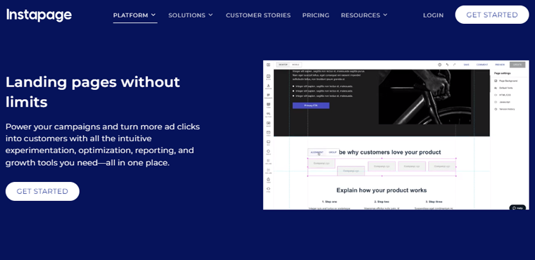
Also, Instapage provides features like A/B testing, heatmaps, and analytics to refine landing page performance continually. The platform integrates with various marketing tools and platforms, making it easy to incorporate into existing workflows.
Pricing
Instapage is a premium service where you can choose from 4 annual pricing plans. They are as follows:
- Scale: For $79 per month you can use HubSpot integration.
- Optimize: For $159 per month you can add multi-step forms on your website.
- Scale: For $239 per month you can enjoy the expanded usage package for the large number of visitors.
- Customized: You can create a custom plan for your website.
4. HelloBar
HelloBar is a versatile tool that focuses on capturing visitor attention and driving conversions through customizable notification bars and pop-ups. These bars can be used to promote special offers, encourage newsletter sign-ups, or direct users to specific pages.
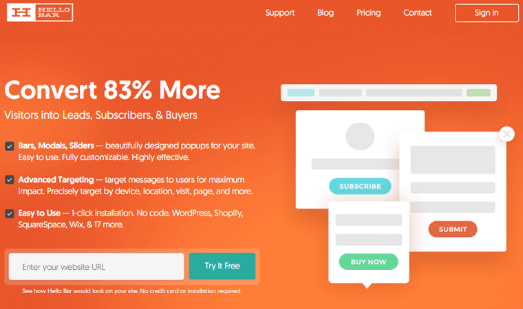
HelloBar includes targeting options, allowing businesses to display messages to specific audience segments. With its simple interface, HelloBar is quick to set up and offers a variety of templates.
Pricing
Pricing is based on the number of views, and it offers a free plan with basic features and premium plans for more advanced functionality. Let’s look into the annual plans:
- Growth: For $24 per month, you will get 50,000 pop-up views monthly and advanced features.
- Premium: For $41 per month, you will get 150,000 pop-up views monthly and premium support.
- Elite: For $83 per month, you will get 500,000 pop-up views monthly with design features, and premium support.
5. OptinMonster
OptinMonster is a lead generation and conversion optimization tool that specializes in creating visually appealing and effective opt-in forms. These forms can be strategically placed on websites to capture leads, reduce cart abandonment, and promote special offers.
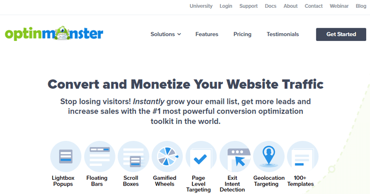
OptinMonster features include exit-intent technology, A/B testing, and personalized messaging. The tool integrates seamlessly with popular email marketing services, making it a valuable asset for building and nurturing customer relationships.
Pricing
OptinMonster offers 4 annual plans based on the level of features required and the size of the user’s business. They are:
- Basic: For $16 per month you can use it on a single site with basic features.
- Plus: For $32 per month you can use it on 2 sites with advanced features.
- Pro: For $69 per month you can use it on 3 sites with pro features.
- Growth: For $99 per month you can use it on 5 sites with 100K page views.
Websites That Follow the CRO Best Practises
Now, let’s go through some of the websites that follow conversion rate optimization practices.
1. Etsy
Etsy, a renowned online marketplace for handmade and vintage goods, excels in conversion rate optimization. The platform employs intuitive navigation, allowing users to easily explore a vast array of unique products.
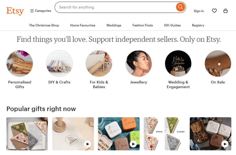
Etsy utilizes targeted recommendations based on user preferences and past interactions for personalized user experience. With a seamless checkout process and transparent product listings, enhances better user journey, contributing to high conversion rates.
2. ILIA Beauty
ILIA Beauty, a cosmetic brand with a focus on clean beauty, strategically implements CRO best practices on its website. This website features visually appealing and easily navigable product pages. So you can explore their range of clean beauty products effortlessly.
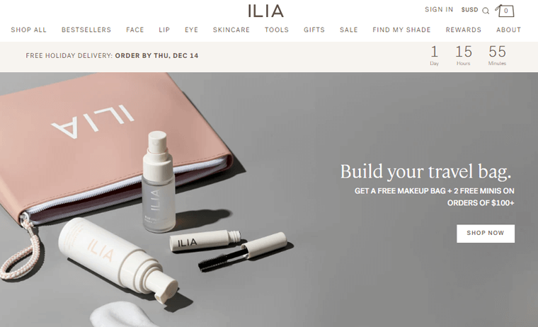
It also emphasizes a minimalist and user-centric design towards key conversion points, like product purchases or newsletter sign-ups. The inclusion of educational content, like tutorials and ingredient information, enhances the user experience and creates a sense of trust.
3. Uncommon Goods
Uncommon Goods, an online marketplace for creatively crafted and unique products, prioritizes CRO by offering an engaging website. The platform excels in showcasing its diverse range of products through high-quality images and detailed descriptions.
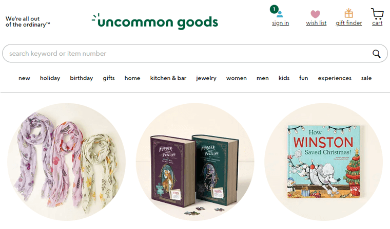
Their strategic placement of call-to-action buttons to guide visitors towards conversions. Also, customer reviews and testimonials provide social proof, building trust and influencing potential buyers.
4. Kylie Cosmetics
Kylie Cosmetics implements effective CRO strategies on its website to drive conversions in the competitive beauty industry. The website boasts visually stunning product displays, captivating imagery, and concise product descriptions.
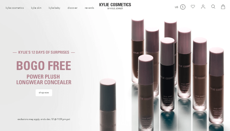
The website utilizes limited-time promotions and exclusive product launches to create a sense of urgency (FOMO.) Additionally, the integration of social media content and influencer collaborations enhances the brand’s visibility and credibility.
5. Spoonflower
Spoonflower, a unique platform for custom fabric and home decor, excels CRO through its user-friendly design and personalized shopping experience. The website features intuitive search and filtering options, enabling users to easily discover and customize products.
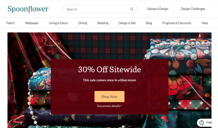
Also, the site incorporates user-generated content, like design reviews and customer projects, creating a sense of community and authenticity. The platform strategically uses product recommendations based on user preferences.
Frequently Asked Questions
1. What are the types of A/B testing?
Types of A/B testing include split URL testing, multivariate testing, and split testing for varied elements like headlines or images to compare performance.
2. Is conversion rate optimization part of SEO?
Conversion rate optimization (CRO) and Search Engine Optimization SEO are related but distinct. CRO focuses on improving user actions, while SEO emphasizes enhancing visibility in search engine results.
3. What affects the conversion rate?
Several factors influence conversion rates, like website design, user experience, persuasive content, and the simplicity of the conversion process.
4. How do you fix a low conversion rate?
To address a low conversion rate, analyze user behavior, optimize website elements, test variations, and consider factors like page speed, trust signals, and effective calls-to-action.
Conclusion
And that’s all, folks! We’ve come to the end of our article on conversion rate optimization best practices you can use.
You’ve now understood how to calculate conversion and CRO best practices. And, we believe you’ll take proactive steps to address them and improve your online stores.
If you’ve got any confusion or hesitation, then please do let us know in the comment section below. We’re happy to help you out.
You can also explore our other reads such as the best digital marketing for business growth and the best B2B plugins for WooCommerce.
Follow us on our social media handles Facebook and Twitter to stay updated with our content.