
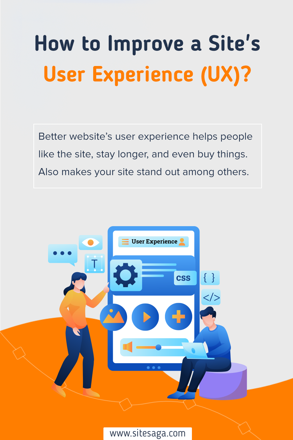
Ever wondered, how to improve user experience on website? If yes, then you’ve come to the right place.
A website with a better user experience is crucial for keeping visitors engaged and satisfied. Whereas, improved navigation and clear design lead to positive interactions, enhancing overall user satisfaction.
But how do you improve your website’s user experience in a way that’s effective and super easy? That’s what this article is all about.
Here, we’ll walk you through simple tips on making your website easy to use and understanding what your users like.
Let’s make your website a user-friendly space for everyone to explore!
Why User Experience (UX) Matters For Your Website?
Making your website easy to use and navigate is essential. Because, when visitors find your site easy to navigate, they’re more likely to stay longer. Consequently, they can be your regular customers.
Moreover, a good user experience is like having clear signs and organized content. So, visitors can find what they’re looking for easily. This will make visitors happy and also tell search engines that your site is helpful.
Here’s why your website should have better UX:
- Increase the visitor’s stay and engage with your content.
- Reduced bounce rates.
- Boosts your website’s visibility in search results.
- Turns visitors into customers or loyal readers.
- Builds trust and credibility with your audience.
- Ensures your site stays relevant and effective over time.
- Finally, leads to better returns on your website-related investments.
You might enjoy reading our article on what makes a good website to walk through your online journey smoothly.
Tips to Improve User Experience on Your Website
Now you know what user experience is important for any website to boost. Now we’ll look into some of the tips on improving the user experience of a website.
1. Optimizing Website’s Speed
Today, every second counts, the speed of your website can make or break the user experience. Optimizing the speed of your online space is not just a technical tweak, it’s a strategic move.
So, let’s dive into some tips to maintain your website’s speed and elevate the user experience.
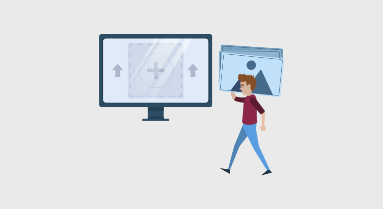
- Optimize Images: Heavy images can slow down your site. Optimize them without sacrificing quality to ensure a smooth and quick loading experience for your visitors.
- Browser Caching: Enable browser caching to store elements for returning visitors. This reduces loading times and provides a more seamless experience for users coming back to your site.
- Streamline Your Code: Simplify your website’s code by removing unnecessary elements. A lean codebase enhances speed and responsiveness, improving overall performance.
- Content Delivery Networks (CDNs): Utilize CDNs to ensure consistent performance globally. It also reduces the physical distance between users and your website, resulting in faster load times.
- Rendering Path: Prioritize loading essential elements first for a quicker visual display. This approach provides users with immediate feedback and fosters a smoother interaction with your site.
- Responsive Design: Ensure your website is adaptable across different devices. Responsive design allows for a consistent and fast user experience, regardless of whether visitors are on desktop or mobile.
Additionally, there are tons of speed optimization plugins like WP Rocket, WP Optimize, Jetpack, etc.
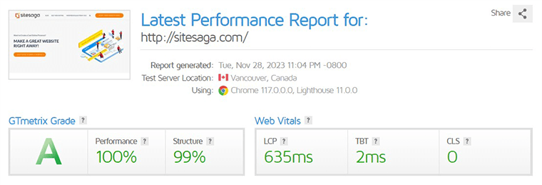
Also, there are online tools like GTmetrix where you can check how well your website performs. Below is an image of how our website performs online.
Besides, for more detailed information you can go through our article on the best WordPress speed optimization plugins.
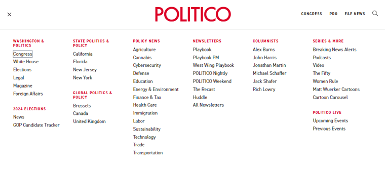
Next on our list is easy and smooth navigation. It’s crucial for a positive user experience as it ensures visitors quickly find what they seek. This also reduces frustration, keeping users engaged and satisfied with the website’s accessibility and ease of use.
For example, if you look at the image below, you’ll fine all the menus under a hamburger menu. Besides, all the menus are categorized properly with main menus and submenus.
Below are some factors to ensure visitors smoothly find their way around your online space.
| Factors | Description |
|---|---|
| Simplify Menu Structures | Simplify your menu structures, using clear and concise labels that guide visitors seamlessly to their destination |
| Content Placement | Place content logically, with a seamless flow. Guide users from one section to another, providing a narrative that captivates and informs. |
| Sticky Navigation | Fixed navigation bar ensures menus remain visible as users scroll. This enhances convenience and serves as a constant guide. |
| Easy Search Functionality | Integrate a search bar prominently, empowering users to find what they seek with precision. It’s the difference between a stroll and a purposeful expedition. |
| Links | Links help users quickly find what they want. And, well-placed links and clear designs let users move easily between pages. |
3. Responsive and Mobile-Friendly
Creating a responsive and mobile-friendly website involves considering several crucial factors. Here are key elements to focus on:
- Ensure whether users access your site from a desktop, tablet, or smartphone, the layout and content adjust fluidly.
- Utilize fluid grids and flexible images to create a design that scales proportionally with different screen dimensions.
- Optimize your website’s navigation for touchscreens. This involves using larger buttons and intuitive gestures, making it easy for mobile users to interact with your site.
- Also, optimize your website’s loading times by compressing images, minimizing unnecessary elements, and utilizing efficient coding practices.
- Regularly test your website on various devices to identify and address any compatibility issues.
- Consider integrating progressive web app features to enhance the user experience. PWAs provide app-like functionalities without the need for users to download an app.
Also, there are many free online tools where you can test whether your website is responsive or not. Here we have an example image where we tested our website on Am I Responsive.
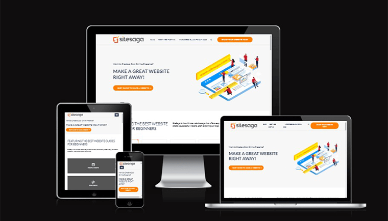
These online tools will display how your website will look on various devices.
4. Accessible Design Practices
Accessible user design is crucial for a better website experience. This practice removes barriers, creating a seamless and welcoming user environment for everyone. Creating a website that welcomes all users, regardless of abilities.
Let’s explore some important tips to enhance user experience through accessible design practices.
| Factors | Description |
|---|---|
| Prioritize Semantic HTML | Utilize header tags, lists, and proper document structure. This helps screen readers and enhances content organization. |
| Implement Accessible Rich Internet Application (ARIA) Landmarks | ARIA landmarks as signposts to guide users to essential sections of your website. |
| Contrast and Color Considerations | Mindful color choices and high contrast ratios help users with visual impairments or color sensitivities. |
| Alt Text for Images | Provide descriptive alt text for images to assist users with visual impairments. |
| Keyboard Navigation | Optimize your website for keyboard navigation to accommodate users who cannot or prefer not to use a mouse. |
| Test with Screen Readers | Do test your website with screen readers to identify potential accessibility barriers. |
| Focus on Readability | Consider font styles, sizes, and spacing for optimal readability. Helping users with different reading abilities and preferences. |
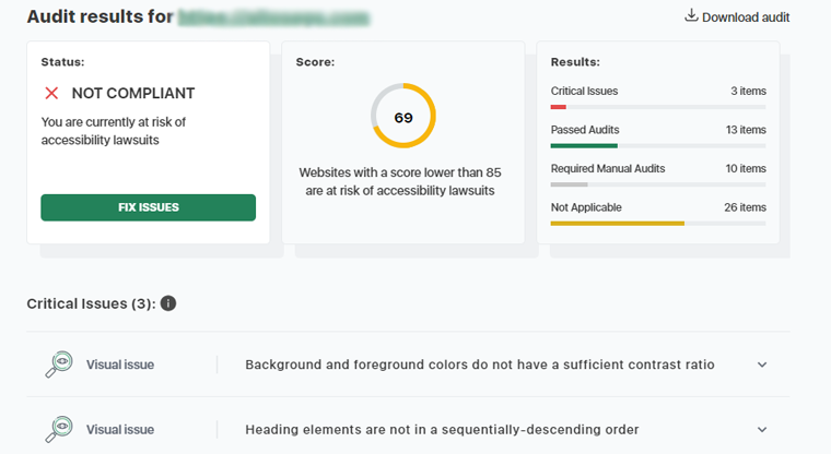
Besides, there are many accessibility checker tools online. One of them is Accessibility Checker, this tool will display whether or not your website is compliant or not as in the example below.
These accessible design practices contribute to a digital space where every user, regardless of abilities, feels welcome and engaged.
5. Understanding Target Audience
Knowing your target audience is vital for a website. Because it helps create content and design that fits what your users like and need. It also makes your website more personalized and enjoyable for visitors.
Without understanding your audience, the website might not connect well with users. Consequently, it is less effective at meeting its goals.
Let’s explore how to make a website that truly connects with your audience.
I) Comprehensive User Research
Start by thoroughly researching your users. Dive into what they like, how they behave, and what challenges they face. It’s not just about clicks, it’s about creating a digital experience that fits what your users want when they explore your online space.
Factors that are included in user research are:
- Demographics
- Interests and hobbies
- Behavior patterns and pain points
- Goals and aspirations
- Technological proficiency
- Communication preferences
- Cultural sensitivity
- Feedback and surveys
- Accessibility needs
- Purchase behavior
- Social media engagement
- Lifestyle choices
- Local trends
II) Understanding In-Depth User Personas
Create detailed user personas that go beyond basic profiles. Dive into their world, grasping their dreams, concerns, and how they navigate the website. The more vividly you decode these personas, the more effectively you can customize your website to meet their needs.
III) Helping Your Audience
Understand that your audience faces challenges and has dreams they carry with them. So, create your content to be a comforting remedy, easing their specific challenges. Whether it’s through informative blog posts that provide solutions.
Additionally, create engaging visuals that speak to their experiences, or interactive tools that offer practical help. Every element should reflect empathy and understanding. By addressing their pain points, your content becomes a source of support and guidance.
Tailoring content to resonate with your audience involves:
- Acknowledging their struggles and desires.
- Your content should be a source of relief.
- Offer practical advice, or provide resources.
This personalized approach not only builds trust but also positions your website as a valuable resource.
IV) Designing for Diversity
The online world is filled with diverse people and preferences. So you need to make sure it welcomes users with different abilities and preferences. This means creating interfaces that everyone can use easily and providing options for multiple languages.
To achieve this consider:
- Incorporating features like easy navigation and readable text.
- Offering language choices for users.
By weaving these elements together, your website becomes a welcoming space for everyone.
V) Gaining Valuable Insights
Today it’s important to have conversations about your brand and industry everywhere. Whereas, social listening is like stepping up into this matter. With this, you also need to pay attention to what people are saying on social media and other digital platforms.
By engaging in social listening, you can extract valuable insights. You get to understand:
- What people are talking about.
- Also, spot trends.
- Take on feedback from your users.
- Look into what your users like.
And, let this collective information guide the story your website tells. It’s a way of staying connected with your audience and shaping your online narrative based on what’s relevant.
6. Quality Content (User-centered content)
Delivering high-quality content is a must for any website to offer a better user experience. It’s about creating a space where every content speaks directly to users’ hearts and minds. Hence, capturing attention and leaving a lasting impression on your users.
Now, let’s see what lies under creating quality content.
First comes, understanding your audience. For this, you need a deep comprehension of the target audience’s preferences, behaviors, and needs.
You can do this by:
- Conducting surveys
- Analyzing user data
- Creating detailed personas
Next, you can work on diverse content formats such as blogs, infographics, videos, and interactive elements.
You can do this by:
- Providing a mix of informative blog posts
- Engaging infographics
- Interactive quizzes
Moreover, clarity and simplicity come in handy when it comes to creating user-centered content. So, never forget to communicate complex ideas with clear and simple language.
Another thing to consider is including interactive elements like polls, quizzes, and surveys for user engagement. Also, optimizing content for easy scanning with clear headings and visuals makes a good pair for creating quality content.
Moving ahead, maintaining a consistent tone and voice throughout the content is a great choice for maintaining quality. So, adopt a friendly and conversational tone in all written content, establishing a consistent brand voice.
By integrating these factors, a website can create a user-centered content strategy that aligns with the audience’s preferences. As well as engages users effectively, and provides a seamless and enjoyable browsing experience.
7. Clear and Smooth Call-to-Actions
A good website design comes hand-in-hand with clear call-to-actions (CTAs). Because it plays the leading role, guiding users through the website’s world.
So, let’s explore the art of crafting CTAs that are not just signposts but seamless invitations, enhancing the user experience.
I) Precise Words
Begin by choosing powerful words that resonate with your audience’s intentions. Instead of generic phrases, use action-oriented language that drives users into the next phase of their journey. A CTA should be a compass, guiding users with clarity.
For example, instead of a plain “Submit,” consider a more engaging “Join the Adventure” for a travel website. Hence prompting users to take the leap into exploration.
II) Capturing Attention
CTAs should not camouflage, they should stand out. Use color contrasts wisely to ensure your CTA buttons are visually arresting. A blend of aesthetics and functionality ensures users’ eyes are effortlessly drawn to the desired action.
For example, on a minimalist page, a vibrant, contrasting color for the CTA button. Like an electric blue against a neutral background, can be visually striking.
III) Proper Placement
Consider the natural flow of user attention and place CTAs strategically. Aligning them with the visual hierarchy of your webpage. Whether above the fold or strategically spaced throughout, the placement should guide users seamlessly.
For example, on an e-commerce site, position the “Add to Cart” close to product descriptions. Ensuring users can swiftly transition from interest to purchase.
IV) Engaging Visuals
A visually engaging CTA is a powerful component for a better user experience. So incorporate appealing graphics or icons alongside your CTAs. Consequently making the action more appealing.
For instance, if you have a fitness website, then add the “Start Your Journey” CTA with a dynamic image of someone engaged in a workout, sparking motivation.
V) Responsive Design
The user experience is not limited to a single device. So, ensure your CTAs are responsive, adapting seamlessly to various screen sizes. Therefore a mobile-friendly CTA ensures users on smartphones and tablets encounter no friction.
For example, adding a “Subscribe Now” CTA on a desktop smoothly transforms into a finger-friendly button on a mobile device.
Therefore, balancing accuracy looks, and usability turns your CTAs into more than buttons.
8. Using Images and Videos Wisely
The images and videos on your website are like the artwork that makes the user experience more enjoyable. Every picture and video should fit with what you’re talking about. Don’t just add them for decoration, make sure they help tell your story.
In addition to that, make sure your pictures and videos have a similar look. This could be the colors, the style, or how they feel.
Besides, add descriptions to images so visually impaired users can understand what they are about. Also, if you have videos, consider adding words on the screen for people who can’t hear well.
Moreover, what you can do is:
- Place pictures and videos where they fit best with your words.
- Make sure your pictures and videos don’t take up too much space.
There are ways to make them smaller without losing quality by using image optimization plugins. Some of them are Imagify, Smush, ShortPixel Image Optimizer, etc.
9. Add Relevant Forms in Respective Pages
Placing forms smartly on your website is about more than just collecting information. It’s like making a friendly and engaging conversation with your users.
Each form, placed and designed with care, becomes a helpful part of your website. Hence, making the user’s online journey enjoyable and easy.
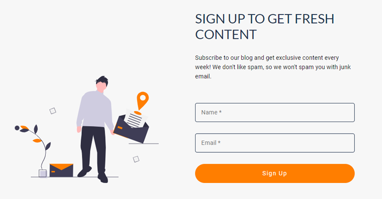
For example, below is the image of the sign-up form of this website. The form below is of minimalist design where users can add their names and email and simply sign-up to the website.
Here, we’ll break down how you can do it well.
- Make sure your forms match what’s on the page. If you’re talking about services, have a form related to that, so users can stay focused on what they’re doing.
- Think about how users move around your site. Put forms where it makes sense, like having a contact form after showing what you offer.
- Add some fun elements to your forms, like fields that appear or change based on what users choose making it more interesting.
- Keep forms simple and only ask for what’s necessary.
- Make it easy for users by using autocomplete, saving time and effort.
- For longer forms, consider breaking them into smaller steps.
- Remember that many people use phones to browse websites. Make sure your forms work well on smaller screens so everyone can use them comfortably.
- Expect users to make mistakes, and help them fix those mistakes with messages. For example add phrases, “No worries, let’s get it right together.”
If you’re confused about where to get started, then check our article on the best form plugins to build online forms.
10. Consistent Design and Structure
Making everything look and work the same way is crucial for creating a website for better user experience. Let’s find out how keeping a similar look and structure on your website can make it better for everyone.
| Factors | Descriptions |
|---|---|
| Colors and Pictures | Make sure all pages on your website have the same colors and pictures. |
| Buttons and Menus | Buttons and menus should look the same on every page. |
| Using the Same Letters | Use the same style of letters so it’s easy for everyone to read. |
| Elements in the Same Order | Make sure everything is in the same order on your website. If a button is at the top of one page, it should be the same on others too. |
| Same Style for Words | Make all the words look the same way. If some words are big and some are small, it might be hard to read. |
| Resembling Your Brand | Make sure it looks like your brand by using the same pictures and colors throughout the website. |
Besides, check your website to make sure everything still looks the same. If something is different, fix it to make your website look good again.
11. Proper Content Categorization
Your website is where people can find and learn things. So it’s vital to make it user-friendly. To get started, you need to start by creating clear categories for your content. Each category should be like a section in a library. So your users know what they’ll find there.
What to do:
- Give your categories names that are easy to understand.
- Arrange categories logically so users can move smoothly from one section to another.
- Create a visual order within categories and put the most important content first, so users see what matters most.
- Utilize tags, as they’re invisible threads connecting related content. Users can explore similar topics easily, enhancing their experience.
And, what not to:
- Avoid using complicated words and choose language that everyone can understand.
- Refrain from using inconsistent labels for similar content.
- Don’t ignore user feedback.
- Refrain from using an excessive number of tags.
Besides, proper content categorization plays a big part in the better user experience of your website. By implementing these tips, it’ll be easy for visitors to explore and engage on your website.
12. Considering User Feedback
Paying attention to what users have to say will guide you toward creating a website with a better experience. It’ll point out what works well and what needs improvement.
Think of your website as a good listener. It’s there to hear what users have to say about their experiences. Use tools like UserFeedback, WPForms, FeedFocal, etc. These tools act like suggestion boxes, giving users a place to share their thoughts.

Also, ensure everyone has a platform to give feedback and welcome constructive criticism. This will help in making your website more refined. Moreover, don’t forget to respond quickly to feedback. Users should feel like they’re having a conversation.
Additionally, it’s better to respond in a personal way. Treating each user’s feedback as a unique conversation and creating a sense of community.
Some other thing includes:
- Learn from feedback data.
- Make continuous improvement.
- Make giving feedback fun with quizzes and games.
By considering user feedback, your website becomes a place that resembles the desires and expectations of your audience. Listen, adapt, and collaborate with users to make your website into something truly special.
13. Using White Space
White space, often referred to as negative space, plays a vital role in user experience. When used correctly, white space boosts readability, guides user attention, and enhances the browsing experience.
Let’s explore things to consider while implementing white space on your website.
- Prioritize white space in mobile design, ensuring buttons and links have sufficient surrounding space.
- Create a visual hierarchy by incorporating appropriate spacing between images, buttons, and text blocks.
- You can use separators to break up sections and make key points more digestible.
- Use white space to highlight branding elements, such as logos and taglines.
- Maintain white space around navigation elements like menus and buttons for a clean and organized appearance.
- Ensure sufficient space between lines and paragraphs for improved text clarity.
- Use tools like heatmaps to analyze user interactions and identify areas where adjustments to white space may be needed.
14. Clear Hyperlinks
The simplicity and clarity of hyperlinks play a vital role in shaping a user’s experience on your website. So, here let’s learn some practical tips to ensure your hyperlinks enhance the user experience.
First, let’s start with:
Significance of Hyperlinks
- Intuitive navigation: Clear hyperlinks facilitate intuitive navigation, allowing users to easily find and access the information they are looking for without confusion.
- Reduced user frustration: Clarity in hyperlink labels reduces user frustration. Users can confidently click on links, knowing where they will be directed.
- Enhanced accessibility: Contributes to enhanced accessibility, benefiting users with visual impairments. Easy-to-distinguish links make navigation inclusive for all.
- Logical placement: Well-placed and labeled hyperlinks contribute to a logical flow of information. Enhancing user’s overall understanding of the website’s content.
- Facilitates goal completion: Clear hyperlinks guide users toward specific goals. Whether it’s making a purchase, accessing information, or completing a form.
- Promotes user exploration: Users are more likely to explore different sections of a website when hyperlinks are clear and inviting.
- Contributes to Search Engine Optimization (SEO): Well-labeled hyperlinks contribute to SEO. Descriptive anchor text can positively impact a website’s search engine ranking.
A website with clear hyperlinks is perceived positively by users. It reflects a commitment to user-friendly design and thoughtful consideration of the user’s journey.
Navigating Through Hyperlinks
There are certain things that you need to consider while adding hyperlinks.
- Enhancing visibility: Use contrast to make links stand out against the background.
- Interactive hover effects: Implement hover effects, like color changes or underlining, to make links interactive.
- Clarity in language: Exclude the use of complex terms that might confuse users. Opt for language that brings clarity and eliminates any uncertainty.
- Designing for accessibility: Ensure links are easily distinguishable for users with visual impairments.
- Handling of error pages: Craft clear hyperlinks even on error pages. Offer alternative routes to transform user frustration into a proper recovery.
Therefore, follow simplicity, engage users, and let the hyperlinks be a part of the improvement of your website user experience.
15. Handling 404 Pages Effectively
Coming across a 404 error page is like hitting a roadblock in your journey. Also, the missing content can make visitors feel lost and frustrated.
But, the good news is, we can turn this not-so-great experience into a positive one. It’s not just doable, it’s essential for making your website better for users.
| Factors | Description |
|---|---|
| Friendly and Informative Messaging | When users land on a 404 page, provide a clear, friendly explanation of the issue. Use a touch of humor or brand tone to make the experience painful. |
| User-Friendly Navigation | Include a navigation menu or a link back to the homepage on the 404 page. Keep options concise and relevant for a quick return to main site areas. |
| Search Functionality | Integrate a visible search bar on the 404 page, allowing users to directly search for what they were looking for. |
| Customized Design Elements | Maintain the overall look and feel of your website on the 404 page. Use custom graphics or illustrations that align with your brand for a seamless user experience. |
| Helpful Links and Suggestions | Offer relevant links or suggestions to popular pages on your website. Redirect users to areas of interest, avoiding the disappointment of not finding the content. |
| Monitor and Improve | Regularly monitor your website for 404 errors. Implement tools to provide insights into broken links and user interactions with error pages. |
Do check our article to know why 404 occurs and get more information.
16. Social Media Sharing
The role of social media sharing is vital in shaping a website’s user experience. It’s not just about adding social media buttons but seamlessly adding them to boost user engagement.
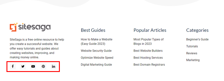
For instance, in the below image, you can see social sharing buttons that are in the footer area. The buttons are very minimal in design and not too big. Also, it perfectly fits the website’s design.
Here’s a breakdown of how you can ensure your website’s social media sharing to boost the overall user experience.
- Position of icons: Position social media sharing icons where users can easily spot them. Consider placing them close to the content, like at the conclusion of blog posts or articles.
- Offer multiple platforms: Allow users to choose the platform on which they want to share content. Offering a variety of social media options caters to diverse user preferences, ensuring wider reach.
- Share previews: Implement share previews that showcase a snippet of the content alongside the social media post. It lets users choose what they share with a quick look.
- Real-time share counts: Displaying real-time share counts offers social proof and encourages more users to engage. Large numbers of social media shares influence visitors to do the same, creating a sense of community around your website.
- Visual appeal: Make sure your social media icons match how your website looks. Choose colors that go well with the rest of your website to keep everything tidy and neat.
Here comes the end of our tips on how to improve user experience on a website. Now, we’ll answer some of your burning questions.
Frequently Asked Questions FAQs
1. What are the best practices of User Experience design?
Best practices include clear navigation, intuitive design, responsive layout, accessibility considerations, user feedback integration, and continuous usability testing.
2. What are the advantages of a better User Experience?
Better User Experience leads to increased user satisfaction, higher engagement, and improved brand perception. It also enhances user loyalty and often leads to business success.
3. Why is User Experience important?
User Experience is crucial as it directly influences user satisfaction, retention, and engagement. A positive UX contributes to the overall success and reputation of a product or service.
4. How to improve User Experience?
You can improve UX by understanding user needs, optimizing website speed, and mobile responsiveness, refining content, and incorporating user feedback. Also, you can regularly test and change design elements.
5. Are User Experience (UX) and User Interface (UI) the same?
No, UX (User Experience) and UI (User Interface) are not the same. UX encompasses the entire user journey, while UI focuses only on the visual and interactive elements of a website.
Conclusion
And that’s all for now! We’ve come to the end of the article on how to improve user experience on the website.
Making a website easy to use is important to help people browse the site and stay longer. Also, it makes the site show up better on the Google search engine and be better than other sites.
We hope this article has helped you with how to improve your website user experience. Hopefully, you also have some ideas on how to improve the website user experience.
If you’ve any further queries about improving user experience, then please leave a comment below. We’ll try to get back to you as soon as possible.
Further, read our other blogs on how to add keyword to website and how to do SEO yourself.
If you like this article, then please share it with your friends and colleagues. Also, don’t forget to follow us on Twitter and Facebook.